I am hard to please when it comes to this company, and in general, I’m told.
I can accept this because I know that literally everything communicates. From the paper that the idea is printed on, to the three-point branded highlighter we hand out at conferences, we need to hit the mark, and so do you.
Our rebranding effort started with a small change almost two years ago. We simply updated the current mark adding in a different color. I always had this uneasy feeling that it wasn’t quite finished. Every now and then, we would revisit it and try to figure out what was holding us back. Part of it was me. I loved the old mark and what it represented. Looked at it, I saw something pure and beautiful – true and needed. It was exactly what was needed in 2008 when we moved towards a stronger emphasis on story, design and social media.
But like all good things that must come to end, this mark had it’s day. I could feel that it was time for a change. Our Art Director began working on concepts late last summer – just some sketches and ideas. And then we had our “ah ha” moment; a friend of mine mentioned a word to me – “tensegrity.” I fell in love with the meaning. I came into the office and said, “I found our word!” The design came together very quickly. Eventually, we were able to add color and life to the black and white marks. There wasn’t a clear consensus about which design or color direction to go exactly, but we knew which direction the brand was going and we used that as a roadmap. We posted the logos around the office, made notes on them, and eventually chose our new logo.
We’ve done plenty of marks for other organizations but none have taken as long as our own – probably 3 months or more. But then again, we weren’t getting paid to do it – not exactly. There is a strong business case for rebranding and doing it right. You can read more about that here.
For now, here are some guidelines to help you succeed at creating a new mark.
Begin with the End in Mind
Where are you going?
When creating a new mark, you want it to personify your aspirational brand, not necessarily the one that exists at this moment.
What will be happening in the future and how can you design the mark that will suit you in 2022?
Rebranding is a process, not an event
When would you ideally launch your brand? At an important event? The beginning of a new year? In conjunction with a significant milestone? Back that date out by 6 to 9 months and then begin the process.
Start With Your Story (or How to Not End Up with a Mark and No Meaning)
Have you ever had something designed for you without taking the time to do a creative brief? Ever asked someone to “just design it” and then ended up with something that didn’t fit your vision?
That happens.
Slow down and understand your story and where you’re going. When we rebranded in 2008, we wrote down the words we wanted to describe the agency. The mark represented those words and our vision for the agency. In 2016, we narrowed it to one word as the anchor and then incorporated it in our long term 2022 business strategy plan.
Know your why
Why are you rebranding?
It’s a fairly straightforward question. Answer it and have consensus before moving forward with a designer.
Some reasons to rebrand may include:
- Current branding is outdated
- Change in company focus
- New Name
- Relevancy
- New Line of Business
- Competitive Influences
- Negative Publicity (Think Arthur Anderson now Accenture)
- Leadership Change
- Merger or Acquisition
- Boredom or Opportunity
- Time for a Change
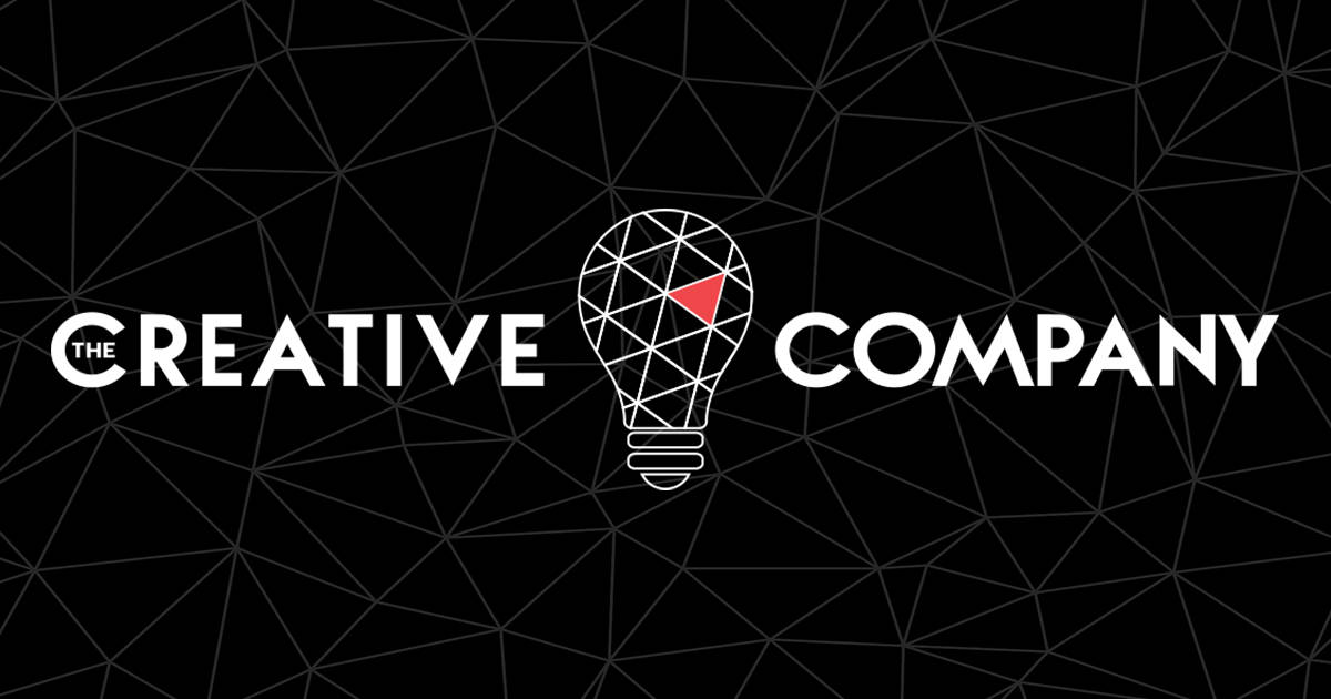
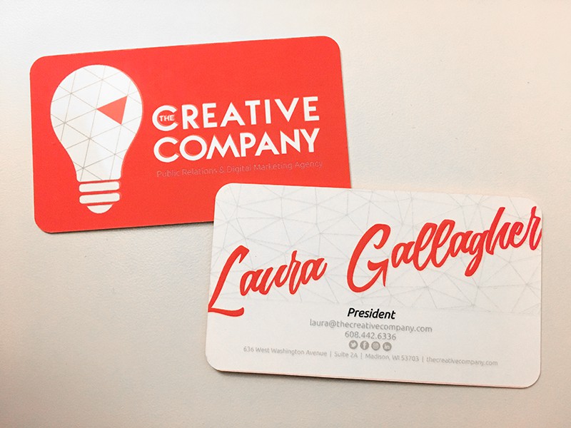
Anatomy of Our Logo – Let’s dissect it.

Notice:
The visual in the background represents “tensegrity.” This is a term Buckminster Fuller coined to represent tension and integrity – an idea that is used in architecture so that things hold together AND have forward movement.
The tensegrity image symbolizes connectedness and networks of ideas and people for The Creative Company.
The light bulb has a dual meaning. It represents the client and the agency – both bright ideas, both needing something to make it come alive.
The chosen font is strong and sure.
The color red symbolizes energy, determination, adventure, action, passion, desire and love. Fun fact about the color red: It has been found that athletes wearing red in combat sports have a greater chance of winning than those who wear blue.
Quick Tips:
Everything communicates.


Copyright © 201_ Entrepreneur.com. All rights reserved. Reprinted with permission from Entrepreneur.com
