If your brand isn’t clear, your sales message won’t land. Here’s how we make it connect.
The Creative Company Team
Every so often, a brand reaches a moment of inflection. You gain clarity, sharpen your voice, and refine your focus—but your website doesn’t quite come along for the ride. The result isn’t a glaring mismatch. It’s a subtle drag. Things don’t click as quickly. The resonance is off. Visitors feel it, even if they can’t name it.
We’ve helped dozens of clients solve that disconnect. And this time, we did it for ourselves.
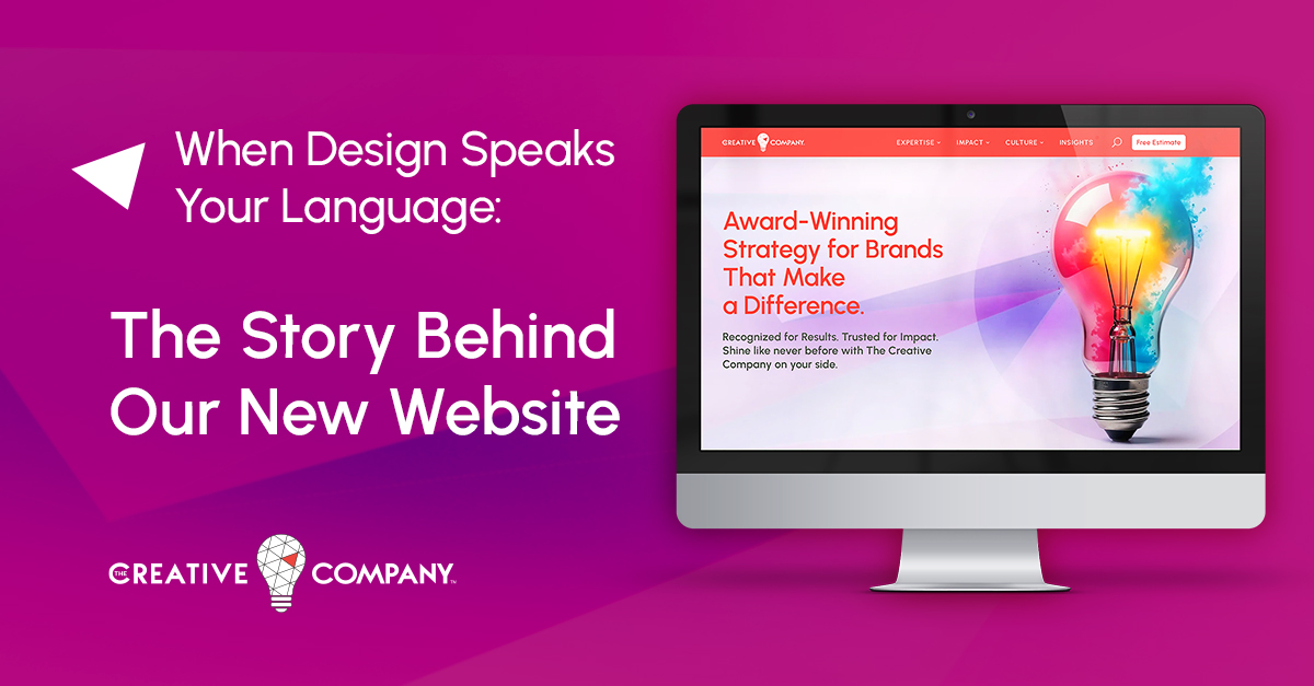
We recently reimagined our website. But this wasn’t just a refresh. It was a full strategic alignment between message, design, and intent. This article walks through how we approached it—and why those same principles can help your brand not just show up, but connect.
Clarity Leads Design
We didn’t start with visuals. We started with meaning.
Every design decision—layout, copy, interaction—was guided by a commitment to clarity. What do visitors need to understand within the first few seconds? Where should their attention go next? How do we reduce effort, invite trust, and guide the experience?
We approached our own website the same way we approach client work—with intention. Navigation was refined to support a more intuitive journey. Each section was deliberately placed to build a cohesive story, not just offer options. This wasn’t a minimalist exercise—it was a commitment to message-first flow. The new site reflects how it feels to work with us: strategic, creative, and intentional.
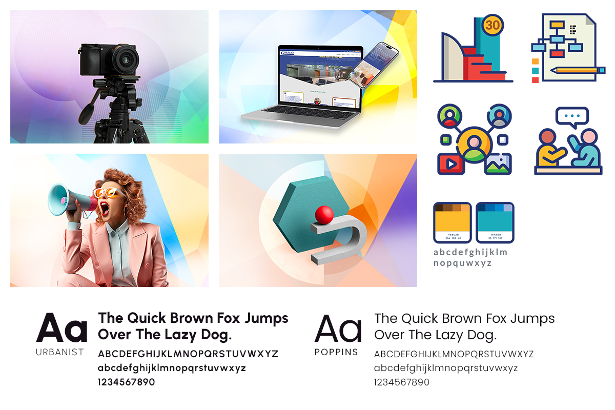
Custom Visuals Carry the Message
A visual isn’t just decoration—it’s communication.
That’s why we created a system of custom icons, illustrations, and typographic pairings that reflect our tone. They don’t just fill space—they signal intention. They carry emotion. They make the unspoken feel understood.
Stock art rarely delivers that. It’s generic by nature. We needed visuals that could be specific—capable of holding nuance, expressing our voice, and deepening the reader’s sense of connection. That’s the kind of visual language that speaks before a visitor even reads a word.
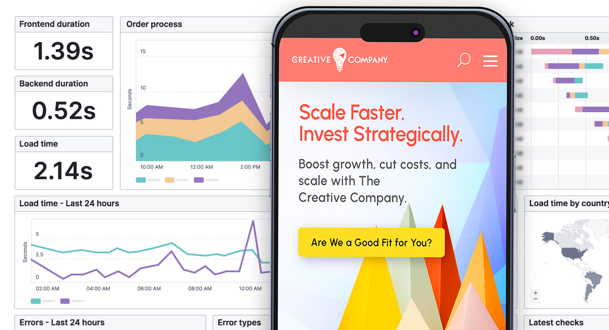
Performance Supports Presence
Speed isn’t a technical bonus. It’s an emotional experience.
From the start, performance was a design principle. We optimized every asset—from images to font loads to animation timing—so that the experience felt smooth and intentional. Not just fast. Purposeful.
When a site loads quickly and interacts without hesitation, it builds momentum. Visitors feel cared for. They stay present. And that clarity in performance reinforces the clarity of the message.
When Every Element Aligns, It Resonates
The right design doesn’t shout. It harmonizes.
And when message, tone, visuals, and behavior all speak the same language—people respond. That’s what Jorden Ludeking from MadREP recognized immediately:
— Jorden Ludeking, Economic Development Specialist, MadREP
That feedback wasn’t about a color palette or layout. It was about alignment. What he felt was the result of message and design working in concert.
Alignment Builds Confidence
When a brand’s voice, visuals, and behavior align, something deeper happens: confidence is built. For the visitor—and for the brand itself.
Your site should show up with the same authenticity you bring to a conversation. When people feel that consistency, it shortens the distance between curiosity and trust. It encourages action. It signals that you know who you are, and how to communicate it.
That’s the clarity we designed for—clarity that’s not just seen, but felt.
Build a Site That Reflects You
Your website is often someone’s first experience of your brand. It should feel aligned with who you are—not just in what it says, but in how it looks, moves, and guides.
That kind of alignment doesn’t come from templates or trends. It comes from clarity about your voice, your values, and the story you’re telling.
We revisited our website with the same critical eye that clients turn to us for. We improved our navigation, keeping only what supported the journey. Each section was crafted to feel like a natural progression, not a scatter of options. This wasn’t about minimalism—it was about message-first flow. Our website speaks to how it is to work with us and shows our capabilities and expertise.
If your brand has evolved and your site hasn’t—or if you sense an opportunity to connect more deeply with the people you serve—we’d love to explore that with you.