CRACKING THE BRAND CODE: PART 2
So, what is a LOGO if it isn't a BRAND?
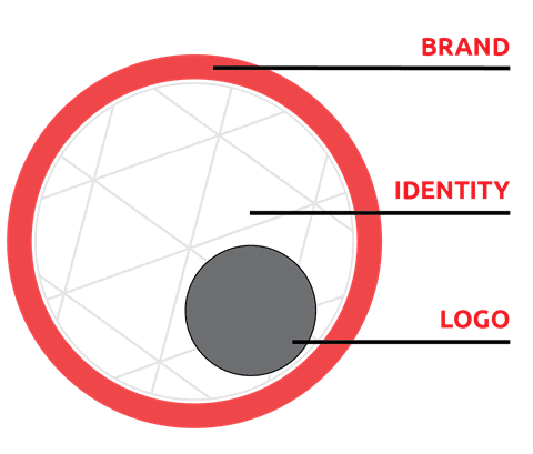
Today, we are going to explore the important role the LOGO (sometimes called a mark, wordmark, logotype, icon) plays in this system and how vital it is for a business to have a clearly defined mark that is used uniformly across the organization.
A logo is only a part of the system and cannot effectively stand alone.
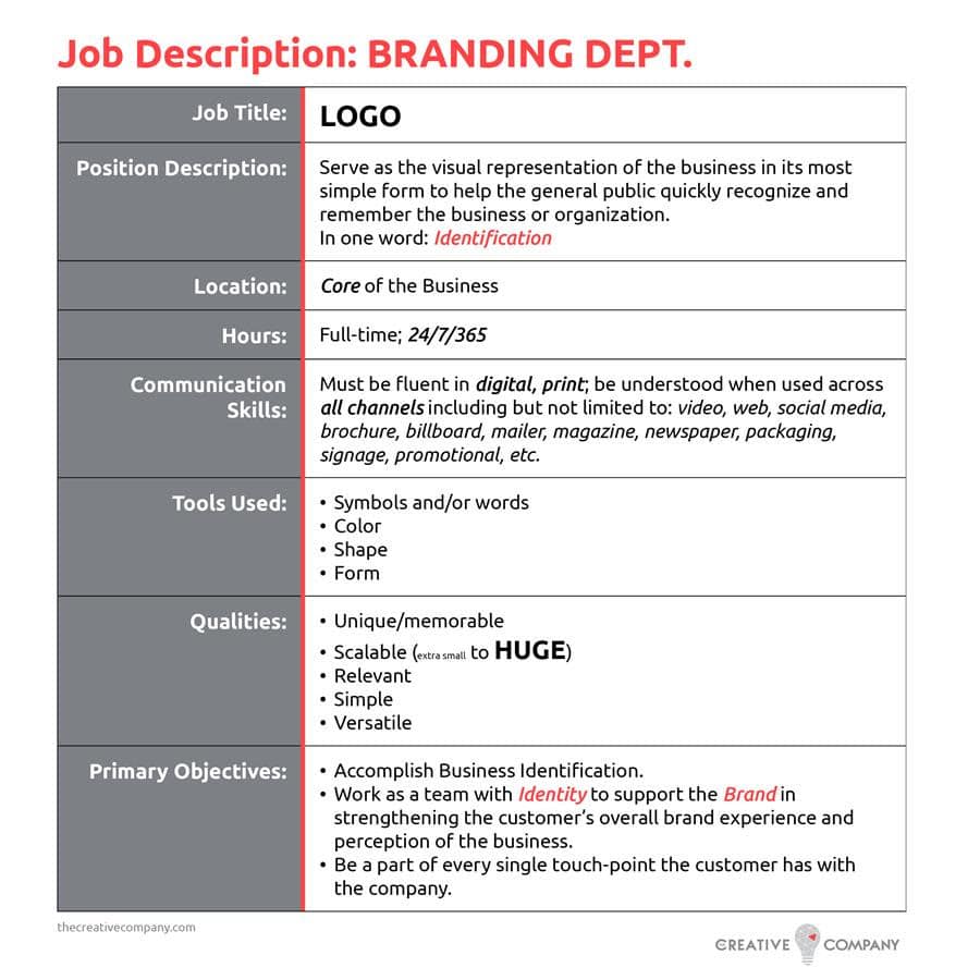
If a LOGO were to have a job description, it would sound something like this:
What is the key factor that keeps a LOGO from doing its JOB?
It is not uncommon for a business or organization to own a strong and impactful logo, but remain unrecognizable to the general public. This can be the result of the logo design being delivered without a "USER MANUAL", or more often, the Manual simply gets filed, lost, and forgotten.

The BRAND Manual:
As part of the process in branding (for a new business) or re-branding (an existing business), a Manual, Brandbook, or set of Guidelines is created. For both internal (staff and management) and external (affiliates, vendors, public) partners, this resource not only supports maintaining the Brand System of the business, but it is vital to the logo’s job.

While there is no industry standard as to what must be included in Brand Guidelines, there are some common key components:
1. About The Brand (mission, vision, values, personas, elevator pitch, etc.)
2. Brand Assets and the appropriate use of each:
- Logo - our focus today!
- typography
- color palette
- collateral - letterhead, business cards, etc.
- imagery
- layout - email marketing
- social media
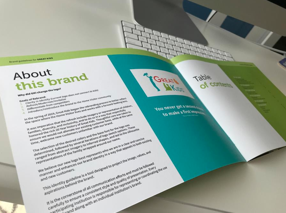
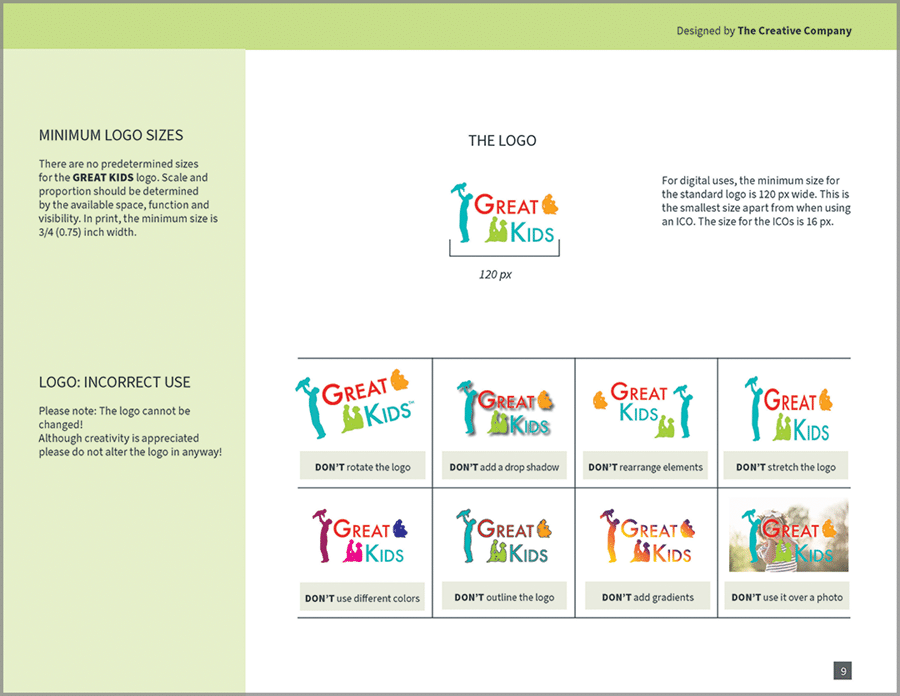
As seen in the example below from a recent rebranding project, clear and specific rules regarding the appropriate, as well as incorrect logo use will be found inside the manual. It is essential that all who work with a business' logo understand these rules and guidelines to maintain the strength and integrity of the brand.
Are Guidelines for a LOGO really that important?
* Head Start programs prepare America’s most vulnerable young children to succeed in school and in life beyond school. The information shared in this article does not in any way reflect on the integrity of the organization and is for illustrative purposes only. This exercise could be repeated with almost any logo with varying degrees of nonconformance. Try Googling YOUR logo to see the results.
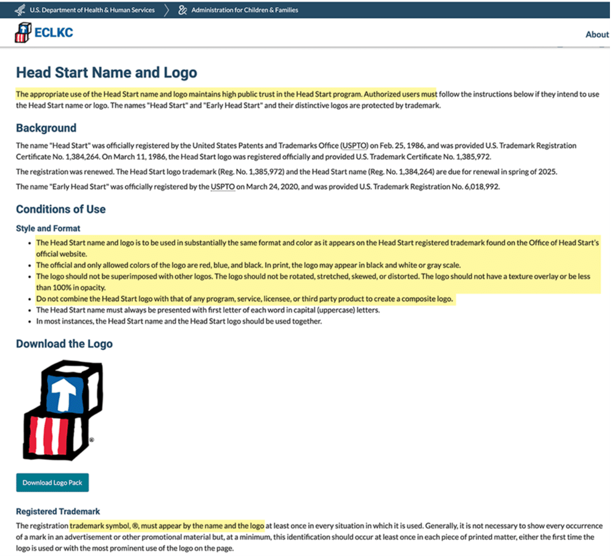
In the first image below, you will see Guidelines for the logo. Note how there are no visuals for appropriate use or incorrect use. In my opinion, visuals are VERY helpful.
The Guidelines were not easily accessible, and while the information regarding use is somewhat clear, there is room for misinterpretation.
This second image shows what can happen when Guidelines are unclear, or perhaps when the user is unaware of the logo Guidelines. I do not believe any of these logos were intentionally designed to confuse or misidentify.
These examples do, however, reinforce the importance of clarity in communication and consistency in brand identification. Clear and accessible Guidelines would certainly help avoid incorrect usage.

Something to Consider
When the public sees your logo, can they quickly identify your business?
Do you know the Rules of your logo?
Do your co-workers or staff know the Rules?
If not, do you have access to the Brand Guidelines or Manual?
If you answered "NO" to any of these questions, I'd love to have a conversation and help you get started on the journey towards "YES!".
When left with ambiguous, unclear, or simply 'no guidelines' for logo usage, the business' identification c
potentially harming the integrity of the business or organization.
I'll be wrapping up our series, CRACKING THE BRAND CODE with the third part of the Branding System: Business Identity.
Did you know it has been communicating with your customers and future prospects? Tune in next week to see what it's been saying!

