8 Tips for a Successful Website
Usability is all about making things easier to use. Less thinking, less frustration. Users should be considered throughout the website design process. Additionally, the layout and design of your site can affect everything from search engine rankings to visitor conversions – so experience matters.
Here are a few simple tips that you can use to make your website more successful:
1. Have a Clear Call to Action
A call to action is the most important piece of information to include on your website. They direct visitors on the steps to take to get involved with your brand. The Web has the attention span of a caffeinated squirrel. The very best websites understand this and get right to the point. Your site should immediately tell visitors what you can do for them. Just as importantly, you need to provide them with a call to action so that they can get started right away. When there is no clear call to action, your visitors may be just as lost as your strategy, and if they are confused, they won’t come back.
Imagine that your site only has 30 seconds to communicate with a potential customer. Will they be able to identify a clear call to action within that short window of opportunity? Or instead, does your site contain a collection of confusing links and blocks of text that will mire down your visitors? Chances are that when a user clicks it will either be on your call to action, or their back button.
Source: http://www.gerrymcgovern.com/nt/2005/nt_2005_05_16-call-to-action.htm
2. Avoid Using Flash
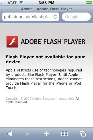
 Flash isn’t a good web development platform. Flash based websites are virtually invisible to search engines, aren’t viewable on mobile devices and the long loading times often steer away visitors.
“Flash also tends to decrease usability of websites for three reasons: it encourages design abuse, it breaks with the Web’s fundamental interaction principles, and it distracts attention from the site’s core value.”
Source: http://www.useit.com/alertbox/20001029.html
3. Optimize with Analytics

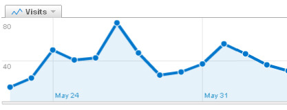
If you don’t track the analytics on your website, you won’t know what is and is not working. Having a baseline of information will help you strategize your next round of site improvements and draw in more visitors.
Using readily available analytics solutions, you can learn a multitude of facts about your audience. You’ll learn about how they found your site, what keywords they tend to search for, where they click on your pages and how long they spend reading your information.
This valuable information allows you to act accordingly in order to optimize your website. You would know which pages are most viewed and which are ignored. You can also see where you are losing people, and which call to actions are working the best. Analytics help you make sure that your website is working for you.
Source: http://ezinearticles.com/?3-Benefits-of-Web-Analytics&id=541362
4. Never Use a Splash Page

Sites with splash pages turn away at least 25% of all visitors, no matter how creative, engaging, exciting or intriguing. Is having a splash page really worth the lost opportunity? By visiting your site they’ve already agreed to enter, why do they have to do it again?
A brilliant quote by Jared Spool of Macromedia, taken from this article:
“When we have clients who are thinking about Flash splash pages, we tell them to go to their local supermarket and bring a mime with them. Have the mime stand in front of the supermarket, and, as each customer tries to enter, do a little show that lasts two minutes, welcoming them to the supermarket and trying to explain the bread is on aisle six and milk is on sale today.”
When a search engine crawls its way to your site, it too will encounter your splash page. Search engines basically ignore Flash, so there’s a very real possibility they won’t be able to find their way into your site. This means that everything else behind that splash page will be invisible to people searching for your content.
Source: http://www.seomoz.org/blog/how-to-convince-a-client-they-dont-need-a-splash-page
5. Make Sure It’s Accessible
 A common mistake that hinders accessibility is the use of .pdf and .doc files instead of web pages to share content with site visitors. Not only does this require extra time and software on the user’s part, but it effectively hides a portion of the site from search engines.
You might be saving yourself some time by simply attaching a file and a link to you page, but in the end you’ll be turning away some of the people you were trying to reach. When you find yourself in a situation where it makes sense to attach a file (for instance, forms for printing), make sure that your site properly describes the content and purpose of the file you are sharing. This will allow both visitors and search engines to find the content that they are looking for.
6. Use Scannable Text
 You’ve been to one of these sites before. You know the ones. Waves of text wash over you and any relevant information the page contains is buried in a cacophony of fonts, colors, paragraphs and menus. Don’t assault your visitors. Instead, allow the design of your site to easily guide them to exactly what they are looking for, whether they know what that is or not.
- Create a consistent navigation system that informs users of their current location within your site.
- Use headings to accurately title your sections and even search engines will have an easier time browsing your site
- Instead of paragraphs of dense information, try to simplify the data using bullet points or icons and short, easy to absorb lines of text.
7. Optimize for Search Engines

One integral part of building a website is building one that people can actually find. Performing some search engine optimization (SEO) will make your website more search-friendly and make visits soar. However, SEO must be thought through from the start. Even the basic design of a website can affect search engine rankings.
The bottom line is that SEO gets you affordable, targeted traffic. Search engines are the best way to bring potential customers to your site. A proper design will give a search engine an accurate understanding of what your site is about, and will direct the people who are already looking what what you have to offer. Effective SEO can be many times more beneficial than banner ads which can be both more expensive and less trusted.
Search engine optimization, properly used, can be the single most powerful marketing tool available today.
Source: http://www.webpronews.com/topnews/2005/09/12/reasons-why-seo-is-the-best-investment-for-any-ceo
8. Something Is Better Than Nothing
Creating or maintaining a website can be a bit overwhelming. Often you pay a great deal of attention to a new website when it’s launched, only to find that you neglect it for the next few months. Spending a little bit of time keeping the content relevant helps a great deal. Not only does new content help to feed search engines and drive up your rankings, but it also gives your visitors reasons to keep coming back. And we all know that visitors devour new content like a scurry of caffeinated squirrels will devour acorns.
As the great Thomas Edison once said, “Genius is 1% inspiration and 99% perspiration.”
-The Creative Company Team

