A lengthy musing about the past:
I was first introduced to the Internet back in 1994. My fourth grade teacher ushered us into the school’s library where we all gathered in the conventional semi-circle around a glowing monitor and extra-clickity keyboard. While I don’t remember any of the text-based conversation that we had with a class from a different school district, I do remember one piece of advice that our teacher gave us. Don’t type in caps. People will think you’re shouting at them.
A bit of a rant about the present:
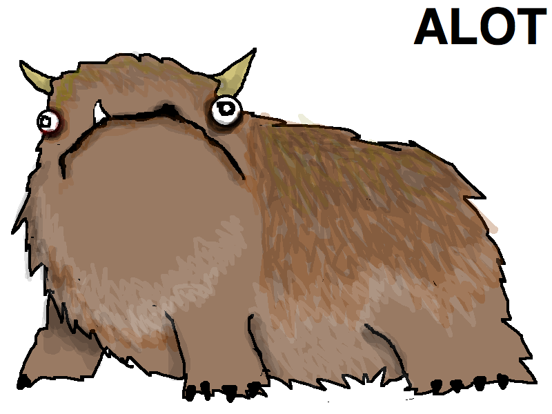
Browsing social media sites, reading blog entries and grimacing my way through any site with a commenting system I find myself wishing more and more that everyone was exposed to and heeded that same piece of advice. Grammar and punctuation matter a great deal as well. So much so that another “grammatically conscientious person” developed a coping mechanism to deal with the appearance of the pseudo-word “alot.” Namely, the creation of a mythical creature that goes by the same name.
An opinion I have formed based on the above musing and rant:
But why does this all matter? We form an opinion about everybody we meet. When you meet someone in person you may take in what they say, but you’ll also notice the tone of their voice, their physical mannerisms, their clothes, their manners and so on and so forth. When encountering someone online, just about all of that is stripped away. What we are left with is text. Sure, these days sites such as Facebook and YouTube allow you communicate through pictures and videos as well, but the predominant form of idea sharing still involves a 26 letter alphabet and a handful of punctuation marks. Thoughts are presented through text, but the very presentation of the text itself may influence the reader’s opinions of the author as much as the content the words convey.
Getting to the point:
But let’s apply this concept to something bigger. Something more relevant to this blog. What opinions do people form when they visit your website? Design is your clothing on the internet. It can be your accent, your tone of voice, your physical mannerisms. It can be playful, professional or both. Does your design yell at your visitors?
This post isn’t about creating a good design. That was covered in Visual Hierarchy 101. This entry is about bringing your design to the web through clean code.
HTML & CSS exist to express information and design:
The key concept of the previously mentioned design post can be clearly seen within HTML source code. Visual hierarchy is such an important aspect of design that specific HTML elements were created to represent it; the header tags. Pick a clean, well structured website. Pop open the source. Sure enough. The “<h1>” tag will must likely include the most important element on the page, often the page/site title. <h2> and <h3> tags (the headers are numbered in order of descending significance) will probably contain section titles, maybe sub-headings. What you are seeing is a visual design expressed through HTML code. Code supporting design.
Design is about organization. About expressing structured ideas. HTML was built to support common structures. Lists are another excellent example of this.
Design and Code can get along:
So you have a beautiful design. But now you need to shove it into HTML code. Maybe it doesn’t fit. Maybe it never looks like you intended. But let’s take a moment. It doesn’t have to be that way.
Recognize the code within the design:
As you become more and more fluent in HTML (and CSS perhaps) you will begin to recognize HTML structural patterns within your design. The title, the subtitles… these can be headers. A block of text is a paragraph. The menu you created can be expressed as a list. When you get comfortable with HTML, you begin to view the process differently. Instead of forcing a design into code, you are instead using code to describe your design.
SEO, your gift for successful translation:
Search engines know about hierarchy. It’s been reported that Google’s algorithm pays nearly as much attention to information expressed in the <h1> header tag as it does to the title of your HTML page. When you code your design correctly, search engines will be able to accurately interpret your design.
Added benefits of HTML:
While it is undeniably true that translating a design in to HTML can impose certain restrictions on the design, there are a few benefits of that translation that can be easy to overlook.
In print, an image must stand by itself. On the web, all images should be strong enough to exist on their own, but images also provide an opportunity for imbedded “alt” information and titles that can be revealed by mousing over the picture.
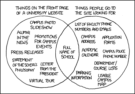
Use of the title tag to express a hidden punch line has become common practice on the XKCD website.
Conclusion:
Design matters enormously on the Internet, but one doesn’t need to fear designing for the web. HTML and CSS exist not to be your enemies, but as tools to allow you to describe your designs via text. Look to this blog in the coming weeks for musings on overcoming common HTML and CSS design restrictions.
-Ian


