
What is Visual Hierarchy?
Whenever I hear a symphony play, I often remark at it’s beauty and complexity. It’s amazing how the sounds of each instrument are coordinated with one another, each takes a turn carrying the melody, and each takes a turn emphasizing the melody.
This is a great metaphor for Visual Hierarchy in design. Much like a symphony, graphical elements on the screen or a page need a structure to reinforce the message. In other words, each of the elements shouldn’t all shout at the same volume. Nor should they all shout at the same time. In order to be clear, each element must be more or less important than other elements in the composition.
In short, Visual hierarchy is
- the emphasis of content based on importance to help a visitor process information.
- making the unclear, clear.
- guides our focus in order of importance
Visual hierarchy is used in page design to help the viewer process information. The dimensions of visual hierarchy are rather simple. Although, you can take these simple rules and combine them (or sometimes break them) in new and creative ways.
Here are some simple principles to help you get started communicating in a visual way:
Size/Weight
Size and weight are the most obvious of all the methods for achieving visual hierarchy. Bigger, “heavier” elements have more emphasis than smaller ones.
Notice how larger, bolder fonts are emphasized in this designer’s website:

Color
Color is another way to differentiate elements in a composition. Simply changing the color of an element makes it stand out from the rest of the elements.
Notice the use of color on this site:

Value/Contrast
Value and contrast, related to color can distinguish elements. The emphasis depends on its background. The more contrast, the more emphasis.

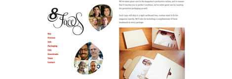
Shape
Simply changing the shape of elements adds emphasis too.
Proximity or “whitespace”
Whitespace or Proximity is another way to emphasize elements from others. Elements with more room to “breathe” usually have a higher visual emphasis than other elements.

Combining Elements
Many of these examples are very simple and for the sake of explanation. There’s nothing wrong with simple – in fact these websites are very successful because of it. However, there are all sorts of ways to combine these principles in new, creative ways. Using these simple rules, the possibilities are endless.
Final Thoughts
- Be deliberate. Don’t be meek. Often you need to over-emphasize to be clear.
- Be simple, then be creative. First say it straight, then say it great.
- Break these rules. Some of the best, most creative designs break these rules. Once you understand them and why they work, they can be broken in deliberate ways.
- Always, always, always, always, remember the audience. Don’t design for yourself, design for them. What messages do they care about most? What will be the most successful?