CRACKING THE BRAND CODE: PART 3
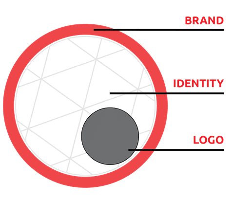
Can a BRAND have an Identity crisis?Absolutely! Just as the terms BRAND and LOGO are often confused, the expression “IDENTITY System” can also be mistaken for the LOGO. The Brand Identity, however, has a very different job from the LOGO but relies on its help as a key player.
Sometimes referred to as the “Visual Identity”, the IDENTITY system is a means to communicate the brand through graphics, imagery, colors, fonts, and usually incorporates the logo. This system reinforces the brand’s character, a very important part of the BRAND story.
.
In last week’s article Cracking the Brand Code: Part 2 , we established that the logo is at the CORE of the Brand, but cannot stand alone. Wrapped within the IDENTITY system, together they form the visual substance of the BRAND system.
We also discussed Brand Guidelines and how critical they are to communicating the brand consistently. Not only do the Guidelines provide clear rules to help the logo effectively do its job, but they also serve as the comprehensive tool for the brand IDENTITY as well. You might recall this list of common Brand Guideline components from last week:
1. About The Brand (mission, vision, values, personas, elevator pitch, etc.)
2. Brand Assets and the appropriate use of each:
- logo - covered in Part 2
- typography
- color palette
- collateral - letterhead, business cards, etc.
- imagery
- layout - email marketing
- social media
Let’s examine how the IDENTITY system works using these Guidelines. Toyota offers a great example to get us started. As part of its Brand Guidelines, the car manufacturer, states,
“The Toyota Visual Identity System (VIS) is a comprehensive tool to guide communications of both the Toyota brand and its products in a unified and consistent manner.”
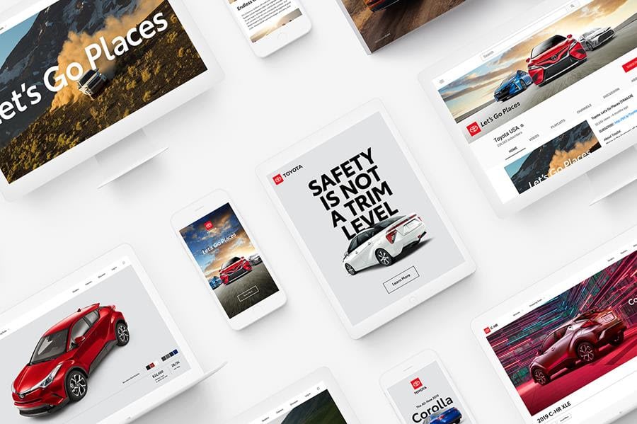
Toyota goes on to say, “Building recognition through consistency,” and “by consistently presenting the Toyota brand and its products, we facilitate recognition of and loyalty to our brand in the marketplace.
"And the higher the recognition and esteem, the more likely that customers will choose our products and services.”
BOOM.
Clear and consistent use of the logo with a comprehensive visual identity system leads to recognition and loyalty, which then ushers consumers towards choosing products or services. Success.
A CLEAR Case of IDENTITY: Brand Guidelines
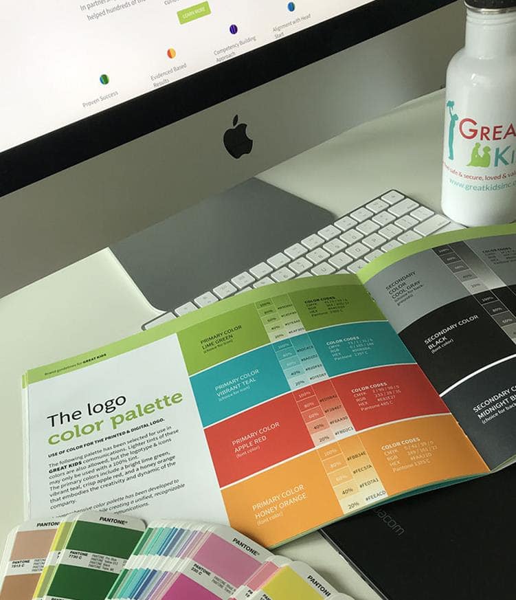
To create a CLEAR and CONSISTENT visual presentation of the business, we come back to the vital powerhouse of the Brand– the Brand Manual, or Guidelines–which help develop the unified visual identity.
To create the Brand IDENTITY, the common tools used from the Guidelines include the logo, typography, the brand color palette, and consistent imagery. A brand’s Identity assets typically fall into two groups:
PHYSICAL: printed material for collateral such as letterhead, business cards, etc.
DIGITAL: website, mobile devices, social media, search engines, and other channels to reach consumers, such as video, Facebook posts, and e-mail marketing.
When creating the Guidelines, a great amount of thought and care goes into selecting the best FONT family, the most suitable COLOR PALETTE, along with cohesive and appropriate IMAGERY to engage and lead your audience to react, remember, and respond to your call.
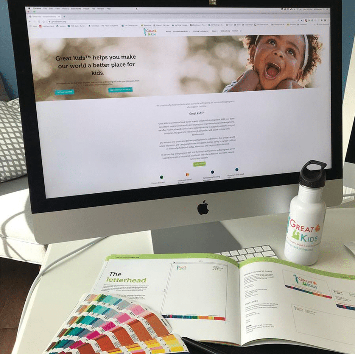
Why are Guidelines for the IDENTITY System essential in supporting the Brand?
Like a RECIPE, you don’t try to bake the bread BEFORE mixing the correct measurements of ingredients together and then placing it in the appropriate container, right?
Yet, many businesses skip ahead in the process, focusing only on the "ad of the day" with an offer in a neon starburst, inconsistent messaging, and using free fonts that every other bargain business utilizes. The results leave the consumer confused and lacking confidence in the quality of the product or service.
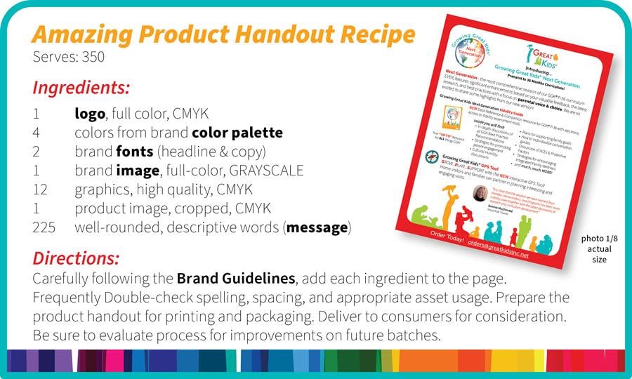
While there is no recipe for the perfect marketing handout, following the Brand Guidelines when creating ANY communication piece will help ensure that you are thoughtfully, accurately, and consistently representing your business. When telling the world who you are and why they should choose you, this is essential.
Something to Consider
It's a rare business that can make the exact same product or provide the exact same service, year after year, without change and I would guess your business doesn't fall into this category.
As your company matures, so will its focus. When this happens, your visual identity will require adjusting and fine-tuning along with the ability to shift in new directions. With this in mind, when your business or organization consistently pays attention to the key aspects of its visual identity, positive results will follow.
I have enjoyed sharing this high-level Brand overview with you and hope you have found our series, CRACKING THE BRAND CODE helpful and enlightening. I would love to hear from you and learn more about your business.
For a free 30-minute branding consultation, drop me an email or click the button below to get started!
